Sunday, 28 November 2010
Hi there . So our next project in Visual Art is the Mini-Masters project. We had to choose a painting by an artist, and we had to reproduce it as best as we could. I chose to do Antibes, by Claude Monet, a painting of the French Riviera. After we finished our painting, we have to research the artist and make a movie showing his or her other paintings. Afterwards, we write a script with all the info we collected, because when we present it, we have to act LIKE the artist. Then we change back into the student and we talk about why we chose this particular painting. So our script has to be dramatic and entertaining.
In my next post, I will post the movie I made for the project. I'm going to present in front of random people from other classes AND (I think- Ms. Bammi is deciding) our PARENTS this Friday!!!!! :O
Monday, 22 November 2010
iSkin Jingle/Poem
Tears drip down the pyramid's eye
A thousand purple rays of light
Flames whip into the starry sky
The all-seeing eye gives you the gift of sight
Picture the future.
A thousand purple rays of light
Flames whip into the starry sky
The all-seeing eye gives you the gift of sight
Picture the future.
Monday, 11 October 2010
Script for Video
Our project for Visual Art class was to paint an abstract picture in contrast colors. I felt relaxed while doing the project, because I love to paint with acrilics and the vibe in the classroom wasn't too disruptive. We first had to start the project by painting abstract art on little cards, then bigger cards, then we had to choose one of our bigger cards to do as the final piece. Some of the problems I ran into along the way was when I was doing the smaller cards, I didn't really know what to paint, so I had to look at my friends cards and get inspiration from them. Jobs in the world that would need this kind of problem solving would be artists or writers, they would need to look at other peoples' work so they get ideas for their own.
This project change my way of thinking about abstract art, because before, whenever I saw a painting with that style, I would say "Meh. A 3rd grader could do that." There are still works of art around the world that look like they could be done by little kids but now I realise that they're actually really hard to come up with. Other situations where this kind of observation is useful is when you're looking through a microscope and you're observing cells. If you have good observation skills then you will notice the difference when it moves (the cell). That example's actually really useful for me because I'm learning about cells in Science right now!! It is important to develop this skill so that you don't become so narrow minded when looking at art work, so that you notice little details that most people don't see. It could affect the way you look at the work of art.
This project change my way of thinking about abstract art, because before, whenever I saw a painting with that style, I would say "Meh. A 3rd grader could do that." There are still works of art around the world that look like they could be done by little kids but now I realise that they're actually really hard to come up with. Other situations where this kind of observation is useful is when you're looking through a microscope and you're observing cells. If you have good observation skills then you will notice the difference when it moves (the cell). That example's actually really useful for me because I'm learning about cells in Science right now!! It is important to develop this skill so that you don't become so narrow minded when looking at art work, so that you notice little details that most people don't see. It could affect the way you look at the work of art.
I like my final piece about 8 out of 10, it didn't really turn out the way I originally painted it on the panel (card). The both halves of the picture, the orange and the blue, they don't really look like the one in the card. But it looks all right. Some advice I would give another kid doing this project is to not be too picky with the result and to try and blend the nearest shade of color you can get to the original color in the card, unless you want to tweak the painting a bit.
The elements of art that I used while doing this project were Color, Line and Value. Color was used in both sides of the painting, and Line is shown in the middle, because there is an obvious border where the 2 contrast colors meet. Value is shown in the color (Value, also called Tone, is the use of light, dark and shade) because it had different shades of colors.
The principles of design I used in this project were Contrast and Dominance . I used Contrast because orange and blue are contrast colors, meaning in each color you can't find the other color in it. Like orange has absolutely no blue in it, and vice versa. I used Dominance because the large circle at the bottom of the drawing is the place where your eyes look first, it balances out the monotony of the 2 colors.
I enhanced my powers of observation while doing this project, and if I could ever give this skill away to someone, I would give it to one of those people who scoff at art and are so narrow minded about it, yet they can't even describe it in intelligent language and instead say "That's stupid." They can't even describe what makes it so "stupid". That's why I want to give this skill to them, so that they'll open they're eyes and realize what is really in front of them.
Sunday, 10 October 2010
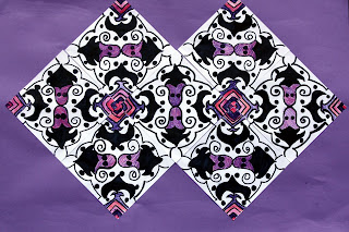
Tessalations

For Design Art class 2010, my class did tessallations. Firstly, we folded a small piece of square paper twice and drew on 1 of the 4 boxes and pattern, using a Sharpie. Then over a lightbox we traced the opposite of the pattern across from it on another box. We kept drawing using the lightbox to see through the paper until it filled up the whole piece of paper and we had a whole pattern. The pattern had to tessallate, meaning both halves of the paper are mirror opposites of each other. Next, I took 7 pieces of the same size square of paper and again, using the lightbox to trace, I copied the tessalation over and over on the papers. When I finished tracing, I picked 2 colors (purple and pink) and colored parts of the tessallation that I wanted to have color. Then i did the same to all of the other copies. The original paper I used as a model. Finally, I came up with a shape I wanted to stick the papers together as, and I framed my work of art on a big purple piece of paper, to match the color of my tessallation.
I felt relaxed while working with this project, because my friends and I were just sitting at the lightboxes and we were talking while working and it was fun. Problems I ran into along the way was when I copied the tessalations over and over, the lines weren't exact and when I put the copies together and I had to work my way around the mistakes. Looking out for mistakes also increased my powers of observation. The elements of art were Lines and Color, which is the unit we're doing right now. I'm really proud of what I've created, it all worked out in the end. Overall, I would give it about 4 out of 5 in terms of me liking it.
The things I learnt doing this project were how to draw a complicated pattern over and over. I always thought that artists had to draw it all by hand. Now I understand the power of the light box, and what an important tool it is for designing. I also learnt how to look closely at where the pattern joins with another piece of paper, I had to be careful because if I didn't look carefully, then the pattern wouldn't be exact and it wouldn't be a good tessellation.
We got inspired to do this project by a brilliant artist named M.C. Escher, who was incredibly lucky to be gifted in both math and art. He incorporated math into his work because his tessellations were always exact and the perspective he used to draw the scenes are very hard to do. He would measure everything, then draw.
Here's a picture of one of his works of art.
It's very confusing to look at, you can't even tell if the perspective is from above or from the side.
Some of the skills I learnt while doing this project might come in handy one day, if I ever decide to become an artist.
Sunday, 11 October 2009
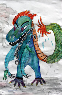
The Story of Blaskar-PART 2

This is a cool picture of me....Blaskar is my name.
They told us the war was gonna end by Christmas 2088.
But I'm starting to doubt that. My name is Blaskar. I'm a monster that fights for the humans. The war against the aliens. This was has been going on since June 2084. 4 years is a long time.
They came on a hot summer's day. I saw them, I was hiding in an alley in New York. I had to hide. I was a monster. The humans would either kill me or put me in a zoo if they discovered me. I would probably be jeered at at and called a freak, get tied up and laughed at. Not cool. So, that's why I HAVE TO hide.
Moving on. So as I was saying they came on a hot summer's day. They came by the thousands. in these huge steel looking spaceships, with lights blinking at the windows.
I remember it started raining when they came. The lightning was deafining. Everyone started screaming when they saw the spaceships. Pandemonium. Chaos. All the armies in the world were alerted and the aliens opened fire with these weird laser guns that killed you instantly. The aleins were greenish with 5 eyes and 3 feet that were colered red.
A few days after the 1st day the aliens came, I offered my assistance to the American gonvernment. They didn't trust me at first but after awhile they employed me to spy on the aliens. I've been working for them ever since.
My name is Blaskar and this is my story. You may not believe me but this is the truth.
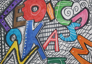
Alphabet

This was one of my first works of art in this Design Art class. We haad to take random letters from the alphabet and make some of them big and the letters behind it small, to give it a sort of distant effect.
P.S.
This is our second-to-the-last Design Art class because the start of the 2nd quarter is I think today. :(
Subscribe to:
Comments (Atom)
